Position布局总结
1 fixed
1.1 说明
生成绝对定位的元素,相对于浏览器窗口进行定位,脱了文档的布局。
1.2 参数
1、 left:元素左侧与浏览器窗口左侧的距离。
2、 right:元素左侧与浏览器窗口右侧的距离。
3、 top:元素顶部与浏览器窗口顶部的距离。
4、 bottom:元素底部与浏览器窗口底部的距离。
5、 z-index:z轴方向上元素显示的层次顺序,由于兼容性问题,其数字一般是1~9。
6、 margin:
a、在top、left设置为百分比的情况下,可以通过设置margin来设置元素在浏览器中显示的位置,如居中显示。
b、当top、left设置为像素时,不能运用此margin来定位元素,因为这样为引起某些浏览器元素的显示冲突。
c、当不设置top、left、right、bottom时,margin属性auto参数在fixed属性中不起作用。
7、 padding:设置元素的内边距。
8、 width:自定义元素的宽度。
9、 height:自定义元素的高度。
10、 border:自定义元素的边框。
1.3 css设置
2 absolute
2.1 说明
生成绝对定位的元素,相对于static定位以外的第一个父元素进行定位,脱了文档的布局。
2.2 参数
1、 left:元素左侧与相对于static定位以外的第一个父元素左侧的距离。
2、 right:元素左侧与相对于static定位以外的第一个父元素右侧的距离。
3、 top:元素顶部与相对于static定位以外的第一个父元素顶部的距离。
4、 bottom:元素底部与相对于static定位以外的第一个父元素底部的距离。
5、 z-index:z轴方向上元素显示的层次顺序,由于兼容性问题,其数字一般是1~9。
6、 margin:
a、在top、left设置为百分比的情况下,可以通过设置margin来设置元素在浏览器中显示的位置,如居中显示。
b、当top、left设置为像素时,不能运用此margin来定位元素,因为这样为引起某些浏览器元素的显示冲突。
c、当不设置top、left、right、bottom时,margin属性auto参数在absolute属性中不起作用。
7、 padding:设置元素的内边距。
8、 width:自定义元素的宽度。
9、 height:自定义元素的高度。
10、 border:自定义元素的边框。
2.3 css设置
2.4 总结
1、 fixed与absolute属性都是脱离了文档后把元素显示在浏览器中,他们的区别在于
a、fixed不会因为父元素的position为relative而受影响
b、absolute会被父元素的position为relative而影响
2、fixed与absolute一般使用left、right、top、bottom来定位,一般不与margin一起使用。
3 relative
3.1 说明
生成相对定位的元素,相对于其正常位置进行定位。
3.2 参数
1、 left:元素左侧与相对于前一位元素或父元素左侧的距离。
2、 right:元素左侧与相对于前一位元素或父元素右侧的距离。
3、 top:元素顶部与相对于前一位元素或父元素顶部的距离。
4、 bottom:元素底部与相对于前一位元素或父元素底部的距离。
5、 z-index:z轴方向上元素显示的层次顺序,由于兼容性问题,其数字一般是1~9。
6、 margin:元素相对于前一位元素或父元素来设置其外边距。
7、 padding:设置元素的内边距。
8、 width:自定义元素的宽度。
9、 height:自定义元素的高度。
10、 border:自定义元素的边框。
11、 float:把元素脱体文档流,此属性会使得relative属性中的height属性没有作用,解决方法是在此元素中添加一个盒子,此盒子属性设置为clear:both。
3.3 css设置
3.4 总结
relative属性的top、bottom、left、right和margin是相对于前一位元素或父元素而设置的,一般使用margin来设置外边距。
4 static
4.1 说明
默认值。没有定位,元素出现在正常的流中(忽略top,bottom,left,right或者z-index声明)。
4.2 参数
1、 margin:static属性只能通过margin来设置元素的外边距,不能使用top、bottom、left、right来设置距离属性。
2、 padding:设置元素的内边距。
3、 width:自定义元素的宽度。
4、 height:自定义元素的高度。
5、 border:自定义元素的边框。
6、 float:把元素脱体文档流,此属性会使得relative属性中的height属性没有作用,解决方法是在此元素中添加一个盒子,此盒子属性设置为clear:both。
4.3 css设置
4.4 总结
static属性是相对于前一位元素或父元素而设置的,且只能使用margin来设置为边距。
5 Demo布局图片
<!DOCTYPE>
<html>
<head>
<meta charset="utf-8"/>
<title>position用法</title>
<style type="text/css">
body{
margin:0;
padding:0;
}
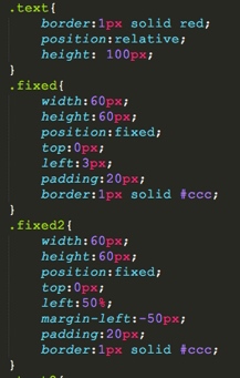
.text{
border:1px solid red;
position:relative;
height: 100px;
}
.fixed{
width:60px;
height:60px;
position:fixed;
top:0px;
left:3px;
padding:20px;
border:1px solid #ccc;
}
.fixed2{
width:60px;
height:60px;
position:fixed;
top:0px;
left:50%;
margin-left:-50px;
padding:20px;
border:1px solid #ccc;
}
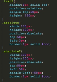
.text2{
border:1px solid red;
position:relative;
margin-top:50px;
height: 150px;
}
.absolute{
width:100px;
height:100px;
position:absolute;
top:50px;
left:3px;
border:1px solid #ccc;
}
.absolute2{
width:100px;
height:100px;
position:absolute;
top:50px;
left:50%;
margin-left:-50px;
border:1px solid #ccc;
}
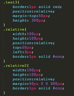
.text3{
border:1px solid red;
position:relative;
margin-top:50px;
height: 300px;
}
.relative{
width:100px;
height:100px;
position:relative;
top:50px;
left:3px;
border:1px solid #ccc;
}
.relative2{
width:100px;
height:100px;
position:relative;
margin:50px 0 0 300px;
border:1px solid #ccc;
}
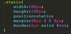
.static{
width:100px;
height:100px;
position:static;
margin:50px 0 0 3px;
border:1px solid #ccc;
}
</style>
</head>
<body>
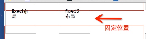
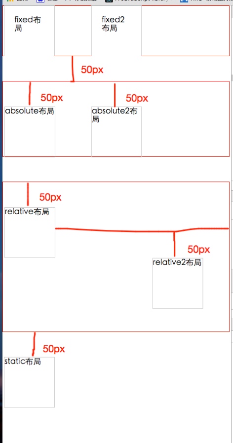
<div class='text'>
<div class="fixed">fixed布局</div>
<div class="fixed2">fixed2布局</div>
</div>
<div class='text2'>
<div class="absolute">absolute布局</div>
<div class="absolute2">absolute2布局</div>
</div>
<div class='text3'>
<div class="relative">relative布局</div>
<div class="relative2">relative2布局</div>
</div>
<div class="static">static布局</div>
</body>
</html>
6 例子测试
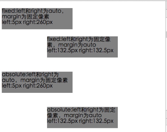
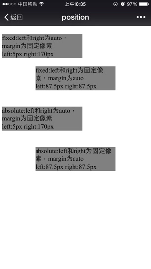
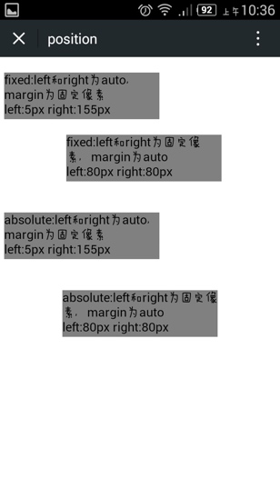
- fixed:left和right为auto,margin为固定像素。
- fixed:left和right为固定像素,margin为auto。
- absolute:left和right为auto,margin为固定像素。
- absolute:left和right为固定像素,margin为auto。
谷歌浏览器截图:
iphone截图:
android截图:
总结:
fixed和absolute在margin为auto,left和right为固定像素的情况下才会居中,相反设置不会居中,会根据设置的marginLeft来定位。
html代码:
<html>
	<head>
		<meta charset="utf-8">
		<meta name="viewport" content="width=device-width initial-scale=1.0 maximum-scale=1.0 user-scalable=0" />
		<meta name="apple-mobile-web-app-capable" content="yes">
		<meta name="format-detection" content="telephone=no">
		<meta http-equiv="x-dns-prefetch-control" content="on" />
		<script type="text/javascript" src="jquery-1.11.1.min.js"></script>
		<title>position</title>
		<style type="text/css">
		body{
			margin:0;
			padding:0;
		}
		.fixed_leftRight{
			position: fixed;
			top: 20px;
			right: auto;
			left: auto;
			height: 60px;
			max-width: 200px;
			padding: 0px;
			margin: 0 5px;
			background-color: grey;
		}
		.fixed_margin{
			position: fixed;
			top: 100px;
			right: 5px;
			left: 5px;
			height: 60px;
			max-width: 200px;
			padding: 0px;
			margin: 0 auto;
			background-color: grey;
		}
		.absolute_leftRight{
			position: absolute;
			top: 200px;
			right: auto;
			left: auto;
			height: 60px;
			max-width: 200px;
			padding: 0px;
			margin: 0 5px;
			background-color: grey;
		}
		.absolute_margin{
			position: absolute;
			top: 300px;
			right: 5px;
			left: 5px;
			height: 60px;
			max-width: 200px;
			padding: 0px;
			margin: 0 auto;
			background-color: grey;
		}
		</style>
	</head>
	<body>
		<div class='fixed_leftRight'>
			fixed:left和right为auto,margin为固定像素
			</br>
			<span id='fixed1_Left'></span>
			<span id='fixed1_Right'></span>
		</div>

		<div class='fixed_margin'>
			fixed:left和right为固定像素,margin为auto
			</br>
			<span id='fixed2_Left'></span>
			<span id='fixed2_Right'></span>
		</div>

		<div class='absolute_leftRight'>
			absolute:left和right为auto,margin为固定像素
			</br>
			<span id='absolute1_Left'></span>
			<span id='absolute1_Right'></span>
		</div>

		<div class='absolute_margin'>
			absolute:left和right为固定像素,margin为auto
			</br>
			<span id='absolute2_Left'></span>
			<span id='absolute2_Right'></span>
		</div>

		<script type="text/javascript">
			var fixed1_left = $('.fixed_leftRight').offset().left;
			var fixed1_right = $(window).width() - fixed1_left - 200;
			 $("#fixed1_Left").text('left:'+fixed1_left+'px ');
			 $("#fixed1_Right").text('right:'+fixed1_right+'px ');


			var fixed2_left = $('.fixed_margin').offset().left;
			var fixed2_right = $(window).width() - fixed2_left - 200;
			 $("#fixed2_Left").text('left:'+fixed2_left+'px ');
			 $("#fixed2_Right").text('right:'+fixed2_right+'px ');

			var absolute1_left = $('.absolute_leftRight').offset().left;
			var absolute1_right = $(window).width() - absolute1_left - 200;
			 $("#absolute1_Left").text('left:'+absolute1_left+'px ');
			 $("#absolute1_Right").text('right:'+absolute1_right+'px ');


			var absolute2_left = $('.absolute_margin').offset().left;
			var absolute2_right = $(window).width() - absolute2_left - 200;
			 $("#absolute2_Left").text('left:'+absolute2_left+'px ');
			 $("#absolute2_Right").text('right:'+absolute2_right+'px ');
		</script>
	</body>
</html>
7 div水平垂直居中布局:absolute + margin : auto
DEMO链接:
http://codepen.io/Dudy/pen/mJKqXa?editors=110/
代码:
<div class="wrap">
  <div class="ele"></div>
</div>
html,body{
  width: 100%;
  height: 100%;
  margin: 0;
}
.wrap{
  position: relative;
  width: 100%;
  height: 100%;
  background-color: #ccc;
  .ele{
    position: absolute;
    left: 0;
    right: 0;
    top: 0;
    bottom: 0;
    margin: auto;
    width: 100px;
    height: 100px;
    background-color: #333;
  }
}
关于这种布局的原理,在标准中能找到如下解释:
链接:
https://www.w3.org/TR/CSS21/visudet.html#abs-non-replaced-width/
中有这样一句话:
The constraint that determines the used values for these elements is: ‘left’ + ‘margin-left’ + ‘border-left-width’ + ‘padding-left’ + ‘width’ + ‘padding-right’ + ‘border-right-width’ + ‘margin-right’ + ‘right’ = width of containing block
这句话说的是absolute性质的盒子,它的包含块的宽度等于它的盒模型的宽度 + left + right值,包含块的高度同理,盒模型包括margin-box、border-box、padding-box、content-box,而在这个居中方法中,.ele的left + right值是0,width是定值,width所在盒子包括了除了margin-box外的那三个box,margin都是auto值,按照上面那个公式,margin-left + margin-right的值应该等于包含块的宽度 - left的值 - right的值 - width的值,也就是说margin-left + margin-right的值等于除了width所占宽度外的剩下宽度,拥有剩下宽度后,就是平分其宽度,以让左右两边相等,达到居中,标准中给出了答案:
If none of the three is ‘auto’: If both ‘margin-left’ and ‘margin-right’ are ‘auto’, solve the equation under the extra constraint that the two margins get equal values, unless this would make them negative, in which case when direction of the containing block is ‘ltr’ (‘rtl’), set ‘margin-left’ (‘margin-right’) to zero and solve for ‘margin-right’ (‘margin-left’)
这里的”three”指的是left, width, right。如果left、right和width都不为auto,同时margin-left和margin-right都是auto,除非特别情况,它们俩就是相等的,而这个例子中不在特殊情况之列,因此两者平分,此时达到了水平居中。而对于垂直方向的margin的auto值的计算,标准中也有如下两句话,跟水平方向的同理(这里的“three”指的是“top, height, bottom”):
the used values of the vertical dimensions must satisfy this constraint: ‘top’ + ‘margin-top’ + ‘border-top-width’ + ‘padding-top’ + ‘height’ + ‘padding-bottom’ + ‘border-bottom-width’ + ‘margin-bottom’ + ‘bottom’ = height of containing block
if none of the three are ‘auto’: If both ‘margin-top’ and ‘margin-bottom’ are ‘auto’, solve the equation under the extra constraint that the two margins get equal values.
垂直方向也就因此也居中了。
这种方法能简单的做到居中,但是必须有width和height值