Ios系统存在input输入框的fixed布局
1 存在input输入框的fixed布局
随着H5的飞速发展,手机端的H5网页也普遍起来了,可是由于手机端存在着各种各样的系统,所以需要考虑兼容性的问题。今天就来说一说iOS系统的一个典型的问题,在iOS手机中,若存在input输入框,且页面有fixed布局的div,那么,当手机键盘弹出来后,fixed布局就失效了,当网页上下滚动的时候,fixed布局的div也会随着一起上下滚动。
2 普遍的fixed布局写法
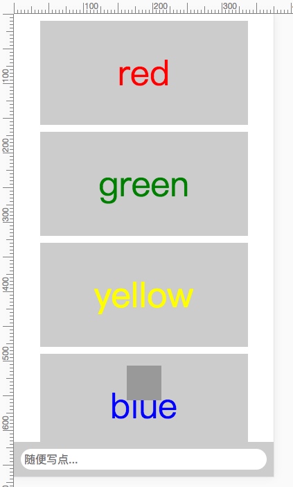
普通情况下,我们的fixed布局是这样的:
html文件(index.html)
<!DOCTYPE html>
<html>
<head>
	<meta charset="utf-8" />
	<meta name="viewport" content="width=device-width initial-scale=1.0 maximum-scale=1.0 user-scalable=0" />
	<meta name="apple-mobile-web-app-capable" content="yes">
	<meta name="format-detection" content="telephone=no">
	<meta http-equiv="x-dns-prefetch-control" content="on" />
	<title>普遍的fixed布局</title>
	<style>
	body{
		margin:0 auto;
		padding:0;
		max-width: 600px;
	}
	.fixedBox{
		position: fixed;
		width: 50px;
		height: 50px;
		background-color: #999;
		bottom: 60px;
		left: 0;
		right: 0;
		margin: 0 auto;
		z-index: 9;
	}
	.fixedBar{
		width: 100%;
		height:50px;
		position: fixed;
		bottom: 0;
		left: 0;
		right: 0;
		margin: 0 auto;
		max-width: 600px;
		background-color: #CCC;
		padding: 0 10px;
		box-sizing: border-box;
	}
	.box{
		width: 300px;
		height: 150px;
		margin: 10px auto;
		text-align: center;
		line-height: 150px;
		background-color: #CCC;
	}
	.red{
		font-size: 50px;
		color: red;
	}
	.yellow{
		font-size: 50px;
		color: yellow;
	}
	.blue{
		font-size: 50px;
		color: blue;
	}
	.green{
		font-size: 50px;
		color: green;
	}
	.input{
		border-radius: 40px;
		width: 100%;
		height: 30px;
		margin: 10px auto;
		line-height: 20px;
		padding:5px;
		border: none;
		outline: none;
		box-sizing: border-box;
		font-size: 16px;
	}
	.ordinaryWrap{
		position: relative;
		margin: 0 auto;
		max-width: 600px;
	}
	</style>
</head>
<body>
	<!--普通写法-->
	<div class="ordinaryWrap">
		<div class='box red'>red</div>
		<div class='box green'>green</div>
		<div class='box yellow'>yellow</div>
		<div class='box blue'>blue</div>
		<div class='box red'>red</div>
		<div class='box green'>green</div>
		<div class='box yellow'>yellow</div>
		<div class='box blue'>blue</div>
		<div class='box red'>red</div>
		<div class='box green'>green</div>
		<div class='box yellow'>yellow</div>
		<div class='box blue'>blue</div>
		<div class='box red'>red</div>
		<div class='box green'>green</div>
		<div class='box yellow'>yellow</div>
		<div class='box blue'>blue</div>
		<div style='padding-bottom:70px'></div>
		<div class="fixedBox"></div>
		<div class='fixedBar'>
			<input class='input' type='text' placeholder='随便写点...' />
		</div>
	</div>
</body>
</html>
可是上面这种方法在iOS端不兼容,故下面会实现两种解决方法:
- 使用absolute布局实现fixed效果。
- 使用flex布局实现fixed效果。
3 使用absolute布局实现fixed效果
此方法的特点是:把内容都存放到一个布局为absolute的div里面,然后使用overflow:auto属性,使得页面的滚动条的焦点从body转移到div。这样,当手机键盘弹出来的时候,由于页面上下滚动条的焦点是在div中,而fixed布局的div与absolute布局的div
html文件(index.html)
<!DOCTYPE html>
<html>
<head>
	<meta charset="utf-8" />
	<meta name="viewport" content="width=device-width initial-scale=1.0 maximum-scale=1.0 user-scalable=0" />
	<meta name="apple-mobile-web-app-capable" content="yes">
	<meta name="format-detection" content="telephone=no">
	<meta http-equiv="x-dns-prefetch-control" content="on" />
	<title>使用absolute布局实现fixed效果</title>
	<style>
	body{
		margin:0 auto;
		padding:0;
		max-width: 600px;
	}
	.fixedBox{
		position: fixed;
		width: 50px;
		height: 50px;
		background-color: #999;
		bottom: 60px;
		left: 0;
		right: 0;
		margin: 0 auto;
		z-index: 9;
	}
	.content{
		position: absolute;
		top: 0;
		bottom: 0;
		left: 0;
		right: 0;
		overflow-y: scroll;
		-webkit-overflow-scrolling:touch;
		margin: 0 auto;
		max-width: 600px;
	}
	.fixedBar{
		width: 100%;
		height:50px;
		position: fixed;
		bottom: 0;
		left: 0;
		right: 0;
		margin: 0 auto;
		max-width: 600px;
		background-color: #CCC;
		padding: 0 10px;
		box-sizing: border-box;
	}
	.box{
		width: 300px;
		height: 150px;
		margin: 10px auto;
		text-align: center;
		line-height: 150px;
		background-color: #CCC;
	}
	.red{
		font-size: 50px;
		color: red;
	}
	.yellow{
		font-size: 50px;
		color: yellow;
	}
	.blue{
		font-size: 50px;
		color: blue;
	}
	.green{
		font-size: 50px;
		color: green;
	}
	.input{
		border-radius: 40px;
		width: 100%;
		height: 30px;
		margin: 10px auto;
		line-height: 20px;
		padding:5px;
		border: none;
		outline: none;
		box-sizing: border-box;
		font-size: 16px;
	}
	</style>
</head>
<body>

	<!--使用absolute布局方法-->
	<div class='content'>
		<div class='box red'>red</div>
		<div class='box green'>green</div>
		<div class='box yellow'>yellow</div>
		<div class='box blue'>blue</div>
		<div class='box red'>red</div>
		<div class='box green'>green</div>
		<div class='box yellow'>yellow</div>
		<div class='box blue'>blue</div>
		<div class='box red'>red</div>
		<div class='box green'>green</div>
		<div class='box yellow'>yellow</div>
		<div class='box blue'>blue</div>
		<div class='box red'>red</div>
		<div class='box green'>green</div>
		<div class='box yellow'>yellow</div>
		<div class='box blue'>blue</div>
		<div style='padding-bottom:70px'></div>
		<div class="fixedBox"></div>
		<div class='fixedBar'>
			<input class='input' type='text' placeholder='随便写点...' />
		</div>
	</div>
</body>
</html>
4 使用flex布局实现fixed效果
此方法就是使用flex布局,把fixed浮层和滚动内容以上下布局显示。而且滚动内容也是使用absolute布局来实现。不多说,直接上例子给大家慢慢体会。
html文件(index.html)
<!DOCTYPE html>
<html>
<head>
	<meta charset="utf-8" />
	<meta name="viewport" content="width=device-width initial-scale=1.0 maximum-scale=1.0 user-scalable=0" />
	<meta name="apple-mobile-web-app-capable" content="yes">
	<meta name="format-detection" content="telephone=no">
	<meta http-equiv="x-dns-prefetch-control" content="on" />
	<title>使用flex布局实现fixed效果</title>
	<style>
	body{
		margin:0 auto;
		padding:0;
		max-width: 600px;
	}
	.box{
		width: 300px;
		height: 150px;
		margin: 10px auto;
		text-align: center;
		line-height: 150px;
		background-color: #CCC;
	}
	.red{
		font-size: 50px;
		color: red;
	}
	.yellow{
		font-size: 50px;
		color: yellow;
	}
	.blue{
		font-size: 50px;
		color: blue;
	}
	.green{
		font-size: 50px;
		color: green;
	}
	.input{
		border-radius: 40px;
		width: 100%;
		height: 30px;
		margin: 10px auto;
		line-height: 20px;
		padding:5px;
		border: none;
		outline: none;
		box-sizing: border-box;
		font-size: 16px;
	}
	.flexWrap{
		position: absolute;
		display: -webkit-box;
		display: -moz-box;
		display: -ms-flexbox;
		display: -webkit-flex;
		display: flex;
		-webkit-box-orient: vertical;
		-ms-flex-direction: column;
		flex-direction: column;
		-webkit-flex-direction: column;
		height: 100%;
		width: 100%;
		overflow: hidden;
		max-width: 600px;
		margin: 0 auto;
	}
	.contentWrap{
		position: relative;
		-webkit-box-flex: 1;
		-ms-flex: 1;
		flex: 1;
		height: 100%;
		width: 100%;
		overflow: hidden;
	}
	.contentBar{
		width: 100%;
		height:50px;
		position: relative;
		margin: 0 auto;
		max-width: 600px;
		background-color: #CCC;
		padding: 0 10px;
		box-sizing: border-box;
	}
	.contentScroll{
		position: absolute;
		top: 0;
		bottom: 0;
		width: 100%;
		overflow-x: hidden;
		overflow-y: scroll;
		-webkit-overflow-scrolling:touch;
	}
	.absoluteBox{
		position: absolute;
		width: 50px;
		height: 50px;
		background-color: #999;
		bottom: 60px;
		left: 0;
		right: 0;
		margin: 0 auto;
		z-index: 9;
	}
	</style>
</head>
<body>
	<!--使用flex布局方法-->
	<div class='flexWrap'>
		<div class='contentWrap'>
			<div class='contentScroll'>
				<div class='box red'>red</div>
				<div class='box green'>green</div>
				<div class='box yellow'>yellow</div>
				<div class='box blue'>blue</div>
				<div class='box red'>red</div>
				<div class='box green'>green</div>
				<div class='box yellow'>yellow</div>
				<div class='box blue'>blue</div>
				<div class='box red'>red</div>
				<div class='box green'>green</div>
				<div class='box yellow'>yellow</div>
				<div class='box blue'>blue</div>
				<div class='box red'>red</div>
				<div class='box green'>green</div>
				<div class='box yellow'>yellow</div>
				<div class='box blue'>blue</div>
			</div>
			<div class="absoluteBox"></div>
		</div>
		<div class='contentBar'>
			<input class='input' type='text' placeholder='随便写点...' />
		</div>
	</div>
</body>
</html>
值得注意的是:
在 iOS 下使用第三方输入法时,输入法在唤起经常会盖住输入框,只有在输入了一条文字后,输入框才会浮出。如:
当点击input输入框,弹出键盘后,fixed布局的浮层还是会移动不见了。但当输入过文字之后,fixed布局的浮层又出现了,且运行没有问题。
故下面需要在js中作出一些新的更改:
//获取软键盘唤起前浏览器滚动部分的高度
var bfscrolltop = document.body.scrollTop;

//在这里‘inputframe’是我的底部输入栏的输入框,当它获取焦点时触发事件
document.getElementById('inputframe').onfocus = function(){
	//设置一个计时器,时间设置与软键盘弹出所需时间相近
    interval = setInterval(function(){
	    //获取焦点后将浏览器内所有内容高度赋给浏览器滚动部分高度
	    document.body.scrollTop = document.body.scrollHeight;
    },100)
};

//设定输入框失去焦点时的事件
document.getElementById('inputframe').onblur = function(){
    clearInterval(interval);//清除计时器
    //将软键盘唤起前的浏览器滚动部分高度重新赋给改变后的高度
    document.body.scrollTop = bfscrolltop;
};
参考文献:
http://efe.baidu.com/blog/mobile-fixed-layout/
http://blog.csdn.net/github_37533433/article/details/66471962
下面再写出三个js相同,css不一样的方案,但实现效果一样。
- 添加js代码,使用absolute布局实现fixed效果。
- 添加js代码,使用flex布局实现fixed效果。
- 添加js代码,使用全部div设置为absolute布局方法实现fixed效果。
5 添加js代码,使用absolute布局实现fixed效果
html文件(index.html)
<!DOCTYPE html>
<html>
<head>
	<meta charset="utf-8" />
	<meta name="viewport" content="width=device-width initial-scale=1.0 maximum-scale=1.0 user-scalable=0" />
	<meta name="apple-mobile-web-app-capable" content="yes">
	<meta name="format-detection" content="telephone=no">
	<meta http-equiv="x-dns-prefetch-control" content="on" />
	<title>ios系统存在input输入框的fixed布局</title>
	<style>
	body{
		margin:0 auto;
		padding:0;
		max-width: 600px;
	}
	.fixedBox{
		position: fixed;
		width: 50px;
		height: 50px;
		background-color: #999;
		bottom: 60px;
		left: 0;
		right: 0;
		margin: 0 auto;
		z-index: 9;
	}
	.content{
		position: absolute;
		top: 0;
		bottom: 0;
		left: 0;
		right: 0;
		overflow-y: scroll;
		-webkit-overflow-scrolling:touch;
		margin: 0 auto;
		max-width: 600px;
	}
	.fixedBar{
		width: 100%;
		height:50px;
		position: fixed;
		bottom: 0;
		left: 0;
		right: 0;
		margin: 0 auto;
		max-width: 600px;
		background-color: #CCC;
		padding: 0 10px;
		box-sizing: border-box;
	}
	.box{
		width: 300px;
		height: 150px;
		margin: 10px auto;
		text-align: center;
		line-height: 150px;
		background-color: #CCC;
	}
	.red{
		font-size: 50px;
		color: red;
	}
	.yellow{
		font-size: 50px;
		color: yellow;
	}
	.blue{
		font-size: 50px;
		color: blue;
	}
	.green{
		font-size: 50px;
		color: green;
	}
	.input{
		border-radius: 40px;
		width: 100%;
		height: 30px;
		margin: 10px auto;
		line-height: 20px;
		padding:5px;
		border: none;
		outline: none;
		box-sizing: border-box;
		font-size: 16px;
	}
	</style>
</head>
<body>

	<!--添加js代码,使用absolute布局方法-->
	<div class='content'>
		<div class='box red'>red</div>
		<div class='box green'>green</div>
		<div class='box yellow'>yellow</div>
		<div class='box blue'>blue</div>
		<div class='box red'>red</div>
		<div class='box green'>green</div>
		<div class='box yellow'>yellow</div>
		<div class='box blue'>blue</div>
		<div class='box red'>red</div>
		<div class='box green'>green</div>
		<div class='box yellow'>yellow</div>
		<div class='box blue'>blue</div>
		<div class='box red'>red</div>
		<div class='box green'>green</div>
		<div class='box yellow'>yellow</div>
		<div class='box blue'>blue</div>
		<div style='padding-bottom:70px'></div>
		<div class="fixedBox"></div>
		<div class='fixedBar'>
			<input class='input' id='inputframe' type='text' placeholder='随便写点...' />
		</div>
	</div>
<script type="text/javascript">
//获取软键盘唤起前浏览器滚动部分的高度
var bfscrolltop = document.body.scrollTop;

//在这里‘inputframe’是我的底部输入栏的输入框,当它获取焦点时触发事件
document.getElementById('inputframe').onfocus = function(){
	//设置一个计时器,时间设置与软键盘弹出所需时间相近
    interval = setInterval(function(){
	    //获取焦点后将浏览器内所有内容高度赋给浏览器滚动部分高度
	    document.body.scrollTop = document.body.scrollHeight;
    },100)
};

//设定输入框失去焦点时的事件
document.getElementById('inputframe').onblur = function(){
    clearInterval(interval);//清除计时器
    //将软键盘唤起前的浏览器滚动部分高度重新赋给改变后的高度
    document.body.scrollTop = bfscrolltop;
};
</script>

</body>
</html>
6 添加js代码,使用flex布局实现fixed效果
html文件(index.html)
<!DOCTYPE html>
<html>
<head>
	<meta charset="utf-8" />
	<meta name="viewport" content="width=device-width initial-scale=1.0 maximum-scale=1.0 user-scalable=0" />
	<meta name="apple-mobile-web-app-capable" content="yes">
	<meta name="format-detection" content="telephone=no">
	<meta http-equiv="x-dns-prefetch-control" content="on" />
	<title>ios系统存在input输入框的fixed布局</title>
	<style>
	body{
		margin:0 auto;
		padding:0;
		max-width: 600px;
	}
	.box{
		width: 300px;
		height: 150px;
		margin: 10px auto;
		text-align: center;
		line-height: 150px;
		background-color: #CCC;
	}
	.red{
		font-size: 50px;
		color: red;
	}
	.yellow{
		font-size: 50px;
		color: yellow;
	}
	.blue{
		font-size: 50px;
		color: blue;
	}
	.green{
		font-size: 50px;
		color: green;
	}
	.input{
		border-radius: 40px;
		width: 100%;
		height: 30px;
		margin: 10px auto;
		line-height: 20px;
		padding:5px;
		border: none;
		outline: none;
		box-sizing: border-box;
		font-size: 16px;
	}
	.flexWrap{
		position: absolute;
		display: -webkit-box;
		display: -moz-box;
		display: -ms-flexbox;
		display: -webkit-flex;
		display: flex;
		-webkit-box-orient: vertical;
		-webkit-box-direction: vertical;
		-ms-flex-direction: column;
		flex-direction: column;
		-webkit-flex-direction: column;
		height: 100%;
		width: 100%;
		overflow: hidden;
		max-width: 600px;
		margin: 0 auto;
	}
	.contentWrap{
		position: relative;
		-webkit-box-flex: 1;
		-ms-flex: 1;
		-webkit-flex: 1;
		flex: 1;
		height: 100%;
		width: 100%;
		overflow: hidden;
	}
	.contentBar{
		width: 100%;
		height:50px;
		position: relative;
		margin: 0 auto;
		max-width: 600px;
		background-color: #CCC;
		padding: 0 10px;
		box-sizing: border-box;
	}
	.contentScroll{
		position: absolute;
		top: 0;
		bottom: 0;
		width: 100%;
		overflow-x: hidden;
		overflow-y: scroll;
		-webkit-overflow-scrolling:touch;
	}
	.absoluteBox{
		position: absolute;
		width: 50px;
		height: 50px;
		background-color: #999;
		bottom: 60px;
		left: 0;
		right: 0;
		margin: 0 auto;
		z-index: 9;
	}
	</style>
</head>
<body>
	<!--添加js代码,使用flex布局方法-->
	<div class='flexWrap'>
		<div class='contentWrap'>
			<div class='contentScroll'>
				<div class='box red'>red</div>
				<div class='box green'>green</div>
				<div class='box yellow'>yellow</div>
				<div class='box blue'>blue</div>
				<div class='box red'>red</div>
				<div class='box green'>green</div>
				<div class='box yellow'>yellow</div>
				<div class='box blue'>blue</div>
				<div class='box red'>red</div>
				<div class='box green'>green</div>
				<div class='box yellow'>yellow</div>
				<div class='box blue'>blue</div>
				<div class='box red'>red</div>
				<div class='box green'>green</div>
				<div class='box yellow'>yellow</div>
				<div class='box blue'>blue</div>
			</div>
			<div class="absoluteBox"></div>
		</div>
		<div class='contentBar'>
			<input id="inputframe" class='input' type='text' placeholder='随便写点...' />
		</div>
	</div>
<script type="text/javascript">
//获取软键盘唤起前浏览器滚动部分的高度
var bfscrolltop = document.body.scrollTop;

//在这里‘inputframe’是我的底部输入栏的输入框,当它获取焦点时触发事件
document.getElementById('inputframe').onfocus = function(){
	//设置一个计时器,时间设置与软键盘弹出所需时间相近
    interval = setInterval(function(){
	    //获取焦点后将浏览器内所有内容高度赋给浏览器滚动部分高度
	    document.body.scrollTop = document.body.scrollHeight;
    },100)
};

//设定输入框失去焦点时的事件
document.getElementById('inputframe').onblur = function(){
    clearInterval(interval);//清除计时器
    //将软键盘唤起前的浏览器滚动部分高度重新赋给改变后的高度
    document.body.scrollTop = bfscrolltop;
};
</script>

</body>
</html>
7 添加js代码,使用全部div设置为absolute布局方法实现fixed效果
html文件(index.html)
<!DOCTYPE html>
<html>
<head>
	<meta charset="utf-8" />
	<meta name="viewport" content="width=device-width initial-scale=1.0 maximum-scale=1.0 user-scalable=0" />
	<meta name="apple-mobile-web-app-capable" content="yes">
	<meta name="format-detection" content="telephone=no">
	<meta http-equiv="x-dns-prefetch-control" content="on" />
	<title>ios系统存在input输入框的fixed布局</title>
	<style>
	body{
		margin:0 auto;
		padding:0;
		max-width: 600px;
	}
	.content{
		position: absolute;
		top: 0;
		bottom: 0;
		left: 0;
		right: 0;
		overflow-y: scroll;
		-webkit-overflow-scrolling:touch;
		margin: 0 auto;
		max-width: 600px;
	}
	.absoluteBar{
		width: 100%;
		height:50px;
		position: absolute;
		bottom: 0;
		left: 0;
		right: 0;
		margin: 0 auto;
		max-width: 600px;
		background-color: #CCC;
		padding: 0 10px;
		box-sizing: border-box;
	}
	.absoluteBox{
		position: absolute;
		width: 50px;
		height: 50px;
		background-color: #999;
		bottom: 60px;
		left: 0;
		right: 0;
		margin: 0 auto;
		z-index: 9;
	}
	.box{
		width: 300px;
		height: 150px;
		margin: 10px auto;
		text-align: center;
		line-height: 150px;
		background-color: #CCC;
	}
	.red{
		font-size: 50px;
		color: red;
	}
	.yellow{
		font-size: 50px;
		color: yellow;
	}
	.blue{
		font-size: 50px;
		color: blue;
	}
	.green{
		font-size: 50px;
		color: green;
	}
	.input{
		border-radius: 40px;
		width: 100%;
		height: 30px;
		margin: 10px auto;
		line-height: 20px;
		padding:5px;
		border: none;
		outline: none;
		box-sizing: border-box;
		font-size: 16px;
	}
	</style>
</head>
<body>
	<!--添加js代码,使用全部div设置为absolute布局方法-->
	<div class='content'>
		<div class='box red'>red</div>
		<div class='box green'>green</div>
		<div class='box yellow'>yellow</div>
		<div class='box blue'>blue</div>
		<div class='box red'>red</div>
		<div class='box green'>green</div>
		<div class='box yellow'>yellow</div>
		<div class='box blue'>blue</div>
		<div class='box red'>red</div>
		<div class='box green'>green</div>
		<div class='box yellow'>yellow</div>
		<div class='box blue'>blue</div>
		<div class='box red'>red</div>
		<div class='box green'>green</div>
		<div class='box yellow'>yellow</div>
		<div class='box blue'>blue</div>
		<div style='padding-bottom:70px'></div>
	</div>
	<div class="absoluteBox"></div>
	<div class='absoluteBar'>
		<input class='input' id='inputframe' type='text' placeholder='随便写点...' />
	</div>
<script type="text/javascript">
//获取软键盘唤起前浏览器滚动部分的高度
var bfscrolltop = document.body.scrollTop;

//在这里‘inputframe’是我的底部输入栏的输入框,当它获取焦点时触发事件
document.getElementById('inputframe').onfocus = function(){
	//设置一个计时器,时间设置与软键盘弹出所需时间相近
    interval = setInterval(function(){
	    //获取焦点后将浏览器内所有内容高度赋给浏览器滚动部分高度
	    document.body.scrollTop = document.body.scrollHeight;
    },100)
};

//设定输入框失去焦点时的事件
document.getElementById('inputframe').onblur = function(){
    clearInterval(interval);//清除计时器
    //将软键盘唤起前的浏览器滚动部分高度重新赋给改变后的高度
    document.body.scrollTop = bfscrolltop;
};
</script>

</body>
</html>