解读css布局之-水平垂直居中
对一个元素水平垂直居中,在我门的工作中是经常遇到的,也是css布局中很重要的一部分,本文就来讲讲css水平垂直居中的一些方法。
先看一张图
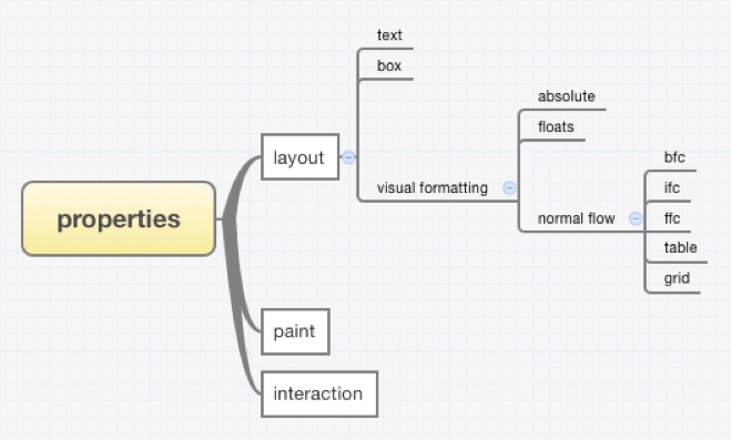
如图所示,css布局时可以分为几大块的:
1、盒子内部的布局
1)文本的布局
2)盒模型本身的布局
2、盒子之间的布局Visual formatting
1)脱离正常流normal flow的盒子的布局
	a)absolute布局上下文下的布局
	b)float布局上下文下的布局
2)正常流normal flow下的盒子的布局
	a)BFC布局上下文下的布局
	b)IFC布局上下文下的布局
	c)FFC布局上下文下的布局
	d)Table布局上下文下的布局
	e)Css grid布局上下文下的布局
所有的css布局其实都是围绕着这些布局模块来设定的,水平垂直居中也一样。
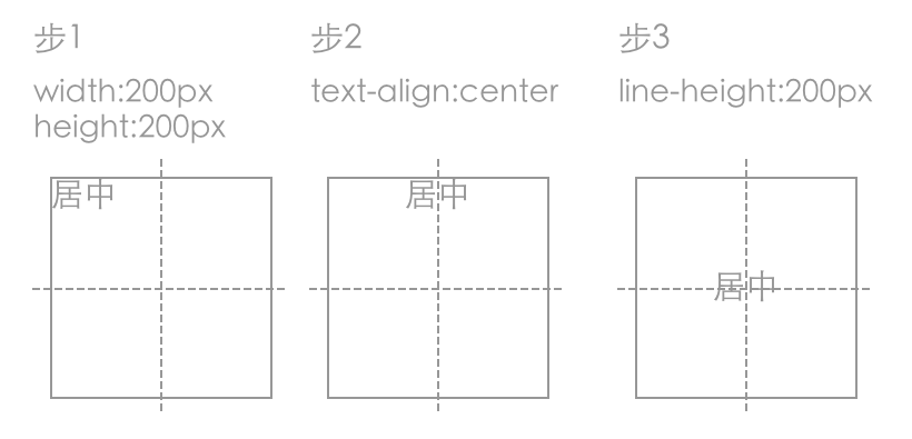
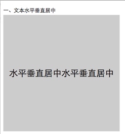
1 文本的水平垂直居中
1.1 line-height + text-align:center
css代码:
.text{
	position:relative;
	height: 400px;
	background-color: #ccc;
}
.text.wrap1{
	width: 400px;
	line-height: 400px;
	text-align: center;
	font-size: 30px;
}
div代码:
<div class='text wrap1'>
	水平垂直居中水平垂直居中
</div>
图解:
例子截图:
总结:
这种方法只适合单行文字的水平垂直居中。
2 利用盒模型的水平垂直居中
我们一般讲的盒模型都是说的块级盒的盒模型,也只有块级盒的盒模型用得多一点,块级盒block-level box又是分别有content-box、padding-box、border-box、margin-box组成,如下图:
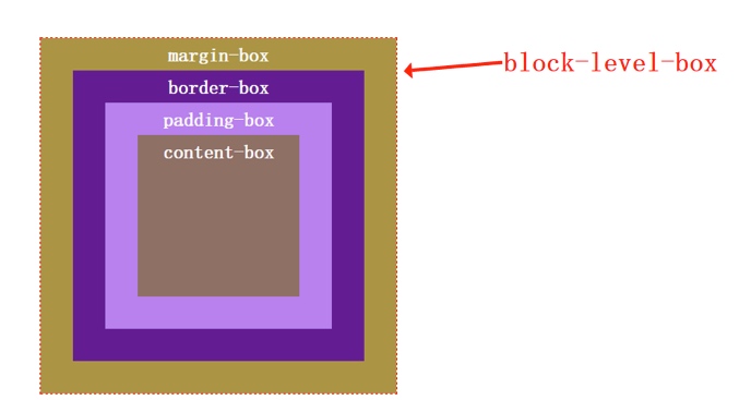
也就是说我任一个子盒子的水平和垂直方向的边与最外面盒子的间距都是可以控制的,因此也就有如下居中方法:
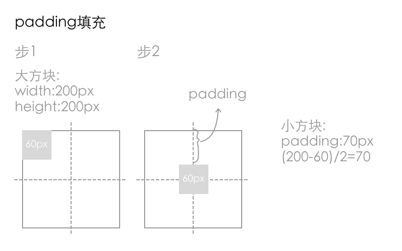
2.1 padding填充
css代码:
.text.wrap2{
	width: 400px;
	height: 400px;
}
.content2{
	width: 100px;
	height: 100px;
	padding: 150px;
	background-color: #333;
	background-clip:content-box;
}
div代码:
<div class='text wrap2'>
	<div class='content2'></div>
</div>
图解:
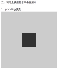
例子截图:
2.2 margin填充
css代码:
.text.wrap3{
	overflow: hidden;
	width: 400px;
	height: 400px;
}
.content3{
	margin-left: auto;
    margin-right: auto;
    margin-top: 150px;
    width: 100px;
    height: 100px;
    background-color: #333;
}
div代码:
<div class='text wrap3'>
	<div class='content3'></div>
</div>
图解:
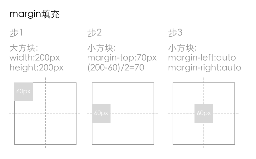
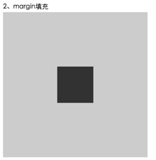
例子截图:
使用margin填充我们需要知道元素的宽度,这点不太灵活,不过css3 搞出了一个加fit-content的属性值,可以动态计算元素的宽度
修改后的css代码:
.text.wrap3{
	overflow: hidden;
	width: 400px;
	height: 400px;
}
.content3{
	margin-left: auto;
	margin-right: auto;
	margin-top: 150px;
	height: 100px;
	width: -webkit-fit-content;
	width: fit-content;
	background-color: #333;
}
使用盒模型进行布局不会产生reflow,兼容也好,使用盒模型布局是一种布局思想,其实仅仅靠它就能实现很多visual formatting才能实现的布局。
3 absolute布局上下文的水平垂直居中
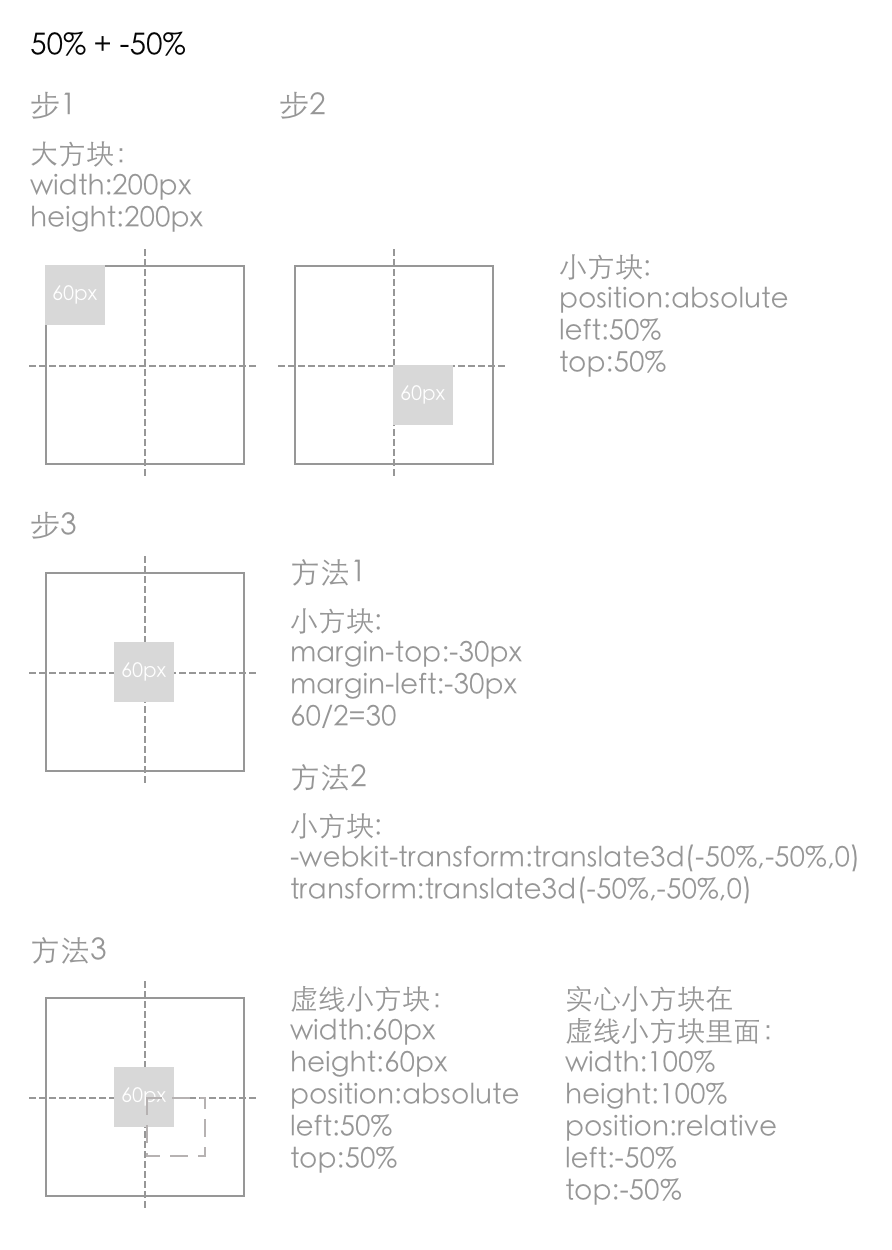
3.1 50%+-50%
原理很简单,就是利用left:50%将盒子的左边先置于父容器的中点,然后再将盒子往左偏移盒子自身宽度的50%,这里有三种具体实现:
css代码:
.wrap4{
	position: relative;
	width: 400px;
	height: 200px;
	border:1px solid;
	background-color: #ccc;
}
.ele{
    position: absolute;
    left: 50%;
    top: 50%;
    background-color: #333;
}
.ele.margin{
    width: 160px;
    height: 100px;
    margin-left: -80px;
    margin-top: -50px;
}
.ele.translate{
    -webkit-transform:translate3d(-50%, -50%, 0);
    transform:translate3d(-50%, -50%, 0);
}
.ele.relative{
    width: 150px;
    height: 100px;
    background-color: transparent;
}
.ele-inner{
    position: relative;
    left: -50%;
    top: -50%;
    width: 100%;
    height: 100%;
    background-color: #333;
}
div代码:
<div class="text wrap4">
    <div class="ele margin">水平垂直居中水平垂直<br>居中水平垂直居中水平<br>垂直居中水平垂直居<br>中水平垂直居中</div>
</div>

<div class="text wrap4">
    <div class="ele translate">水平垂直居中水平垂直<br>居中水平垂直居中水平<br>垂直居中水平垂直居<br>中水平垂直居中</div>
</div>

<div class="text wrap4">
    <div class="ele relative">
    	<div class="ele-inner">水平垂直居中水平垂直<br>居中水平垂直居中水平<br>垂直居中水平垂直居<br>中水平垂直居中</div>
    </div>
</div>
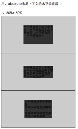
图解:
例子截图:
总结:
上面三个方法中,margin方法和relative方法都需要知道元素的宽高才行(relative方法只知道高也行),适用于固定式布局,而transform方法则可以不知道元素宽高。
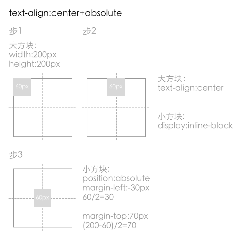
3.2 text-align:center + absolute
text-align:center本来是不能直接作用于absolute元素的,但是没有给其left等值的行级absolute元素是会受文本的影响的。
css代码:
.wrap5{
  	text-align: center;

  	width: 400px;
  	height: 400px;
  	background-color: #ccc;
  	font-size: 0;
}
.ele5{
	position: absolute;
	margin-left: -50px;
	margin-top: 150px;

	width: 100px;
	height: 100px;
	display: inline-block;
	background-color: #333;
}
div代码:
<div class="wrap5">
  	<div class="ele5"></div>
</div>
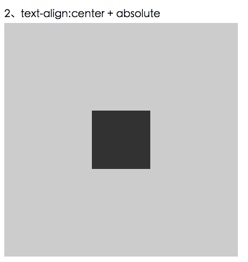
图解:
例子截图:
解析:
简单解释下,首先,text-align:center作用的是文本而不是absolute的元素,但是,当absolute元素为inline-block的时候,它会收到文本的影响,然后这里会是个匿名的文本节点。
然后这个匿名文本由于受到text-align:center影响居中了,这个时候absolute盒子的左边根父容器的中点对齐了,所以就还要往回拉50%,这里用的是margin-left,也可以用其他方式拉。然后就是垂直方向的对齐,垂直方向时不能被操作文本的属性影响的,所以这里用的是margin-top来让它偏移下去。
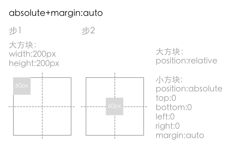
❖3.3 absolute + margin:auto
css代码:
.wrap6{
	position: relative;
	width: 100%;
  	height: 400px;
	background-color: #ccc;
}
.ele6{
	position: absolute;
	left: 0;
	top: 0;
	right: 0;
	bottom: 0;
	margin: auto;
	width: 100px;
	height: 100px;
	background-color: #333;
}
div代码:
<div class="wrap6">
  	<div class="ele6"></div>
</div>
图解:
例子截图:
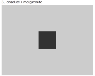
解析:
关于这种布局的原理,在标准中能找到如下解释:
absolute性质的盒子,它的包含块的宽度等于它的盒模型的宽度 + left + right值,包含块的高度同理,盒模型包括margin-box、border-box、padding-box、content-box,而这个居中方法中,.ele的left + right值都是0,width是定值,width所在盒子包括了除了margin-box外的三个box,margin都是auto值,按照上面那个公式,margin-left + margin-right的值应该等于包含块的宽度 – left 的值 –right 的值 –width 的值,也就是说margin-left + margin-right的值等于除了width所占宽度外的剩下宽度,拥有剩下宽度后,就是平分其宽度,以让左右两边相等,达到居中,标准中给出了答案:
如果left、right和width都不为auto,同时margin-left和maargin-right都是auto,除非特别情况,它们倆就是相等的,而这个例子中不在特殊情况之列,因此两者平分,此时达到了水平居中。而对于垂直方向的margin的auto值的计算,标准中也有如下两句话,根水平方向的同理,垂直方向也就因此也居中了。
这种方法能简单的做到居中,但是必须有width和height值。
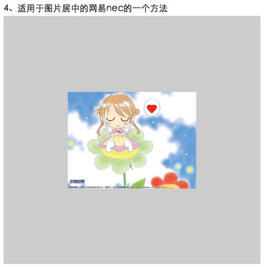
3.4 适用于图片居中的网易nec的一个方法
css代码:
.wrap7{
	position: relative;
	width: 100%;
	height: 500px;
	background-color: #ccc;
}
.wrap7 p{
	position: absolute;
	left: 50%;
	top: 50%;
	margin: 0;
}
.wrap7 p img:nth-child(1){
	width: 100%;
	position: static;
	visibility: hidden;
}
.wrap7 p img:nth-child(2){
	width: 100%;
	position: absolute;
	right: 50%;
	bottom: 50%;
}
div代码:
<div class="wrap7">
  	<p>
  		<img ondragstart="return false" src="1.jpg">
  		<img ondragstart="return false" src="1.jpg">
  	</p>
</div>
图解:
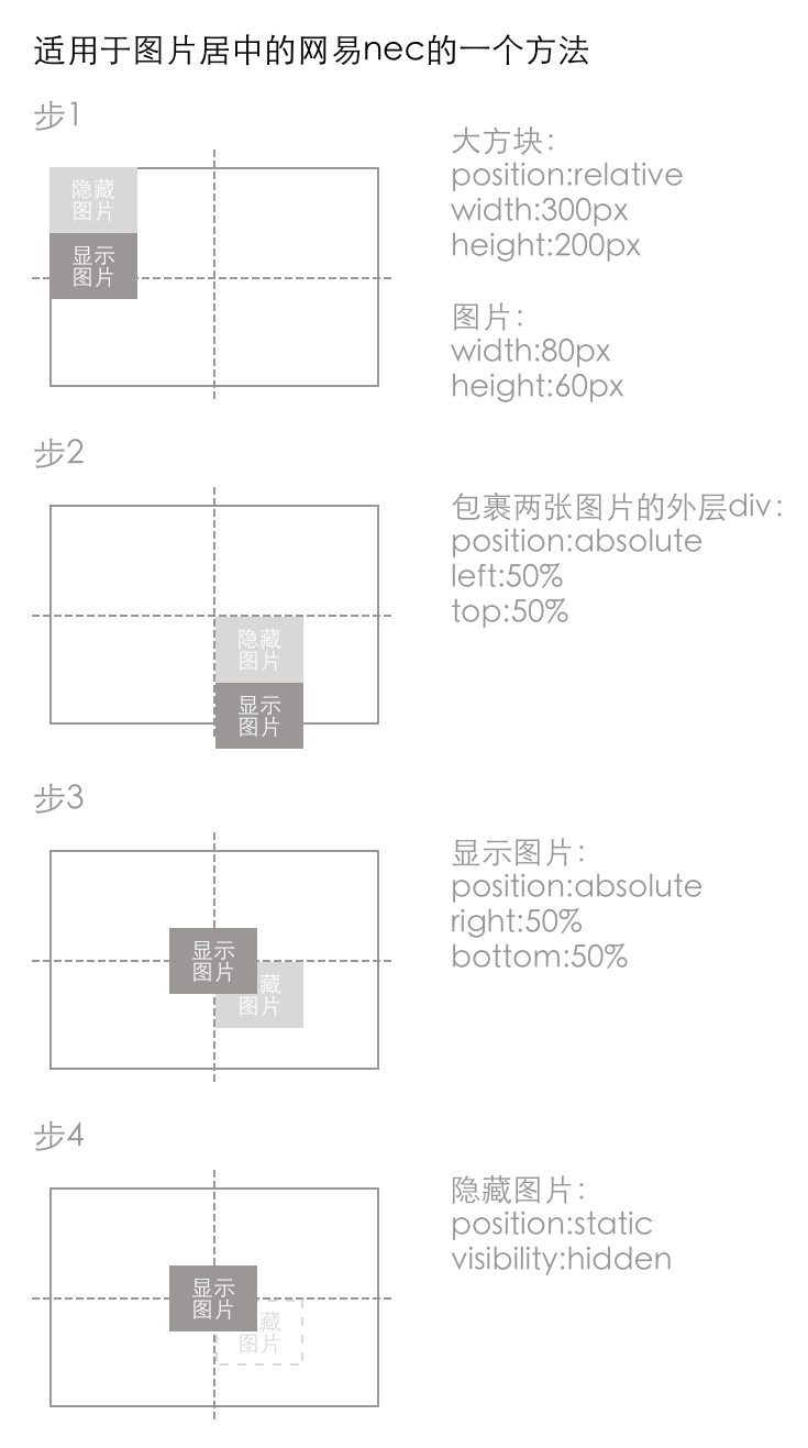
例子截图:
解析:
这种方法主要是利用了一个图片进行占为,以让父容器获得高宽,从而让进行-50%偏移的图片能有一个参照容器作百分比计算。优点是可以不知道图片的大小,随便放长尺寸不超过父容器的图片上去都能做到居中。另外,兼容性好,如果是不实用nth-child选择器的话,IE6都是能 顺利兼容的。
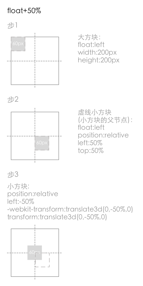
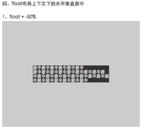
4 float布局上下文的水平垂直居中
4.1 float + -50%
css代码:
.wrap8{
	float: left;
	width: 100%;
	height: 400px;
	background-color: #ccc;
}
.ele8{
	float: left;
	position: relative;
	left: 50%;
	top: 50%;
}
.ele8-inner{
	position: relative;
	left: -50%;
	-webkit-transform: translate3d(0, -50%, 0);
	transform: translate3d(0, -50%, 0);
	background-color: #333;
	color: #fff;
}
div代码:
<div style='overflow:hidden'>
	<div class="wrap8">
		<div class="ele8">
		    <div class="ele8-inner">居中居中居中居中居中居中<br>居中居中居中居中居中居中居中居中居<br>中居中居中居中居中居中居中居中居中居<br>中居中居中居中居中居中居中</div>
		</div>
	</div>
</div>
图解:
例子截图:
解析:
这种方法的原理,首先是利用float属性将需要居中的元素的父元素 .ele的宽度收缩,然后left:50%,将 .ele的左边和水平中线对齐,这个时候还没有居中,还需要将其往回拉自身宽度的50%,于是 .ele-inner便是真正需要水平居中的元素,给它一个position:relative,将其往回拉自身宽度50%就行了。对于垂直方向,依然是先将 .ele top:50%到垂直方向中点,但是这时给 .ele-inner top:50%是不起作用的,因为如果没有给父元素明确高度的话,这个50%是计算不出来的,因此,就有了transform:translate3d(0, 50%, 0)。
这种方法的好处是元素可以不定宽,任何时候都可以做到居中。
在w3cplus的站上发现这个方法,这个方法很好,兼容性好,还可以不定宽,但发现有一个问题:
就是当居中元素的父元素left:50%时,如果元素宽度足够大,会超出外面的容器,而如果外面的容器又正好是overflow:auto的话,吗就会在外面产生滚动条,后来找到了一个办法,基本思想是利用元素超出父元素的左边不会产生滚动条的特性。
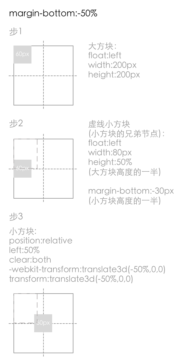
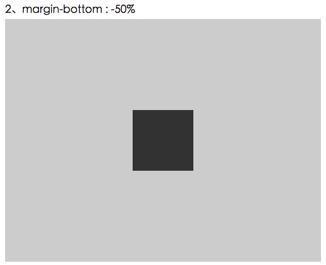
4.2 margin-bottom:-50%
css代码:
.wrap9{
	float: left;
	width: 100%;
	height: 400px;
	background-color: #ccc;
}
.placeholder9{
	float: left;
	width: 100%;
	height: 50%;
	/*居中元素.content高度一半*/
	margin-bottom: -50px;
}
.content9{
	position: relative;
	left: 50%;
	transform:translate3d(-50%, 0, 0);
	clear: both;
	/*演示用,实际不需要定宽*/
	max-width: 100px;
	height: 100px;
	background-color: #333;
}
div代码:
<div style='overflow:hidden'>
	<div class="wrap9">
		<div class="placeholder9"></div>
		<div class="content9"></div>
	</div>
</div>
图解:
例子截图:
总结:
这种方法是先让占位元素 .placeholder占据50%高度,然后给一个居中元素高度一半的-margin-bottom,然后下面的元素只要跟着摆放就能垂直居中了。水平方向就是利用translate做偏移。
这种方法就是各种固定死,首先最外层的父容器需要一个固定高度,以让 .placeholder的height:50%有效,然后,margin-bottom也需要固定死,而且得需要知道居中元素高度。单纯就水平方向来说,这个方法比较适合需要兼容低版本IE的固定式布局的项目,因为兼容性好。
5 BFC布局上下文下的水平垂直居中
BFC的全称是块级排版上下文,BFC布局上下文下的布局其实就是利用盒模型本身进行的布局,前面在利用盒模型布局的那一节中已经讲过了。
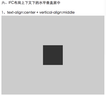
6 IFC布局上下文下的水平垂直居中
IFC简单的理解为display为inline性质的行级元素的布局。
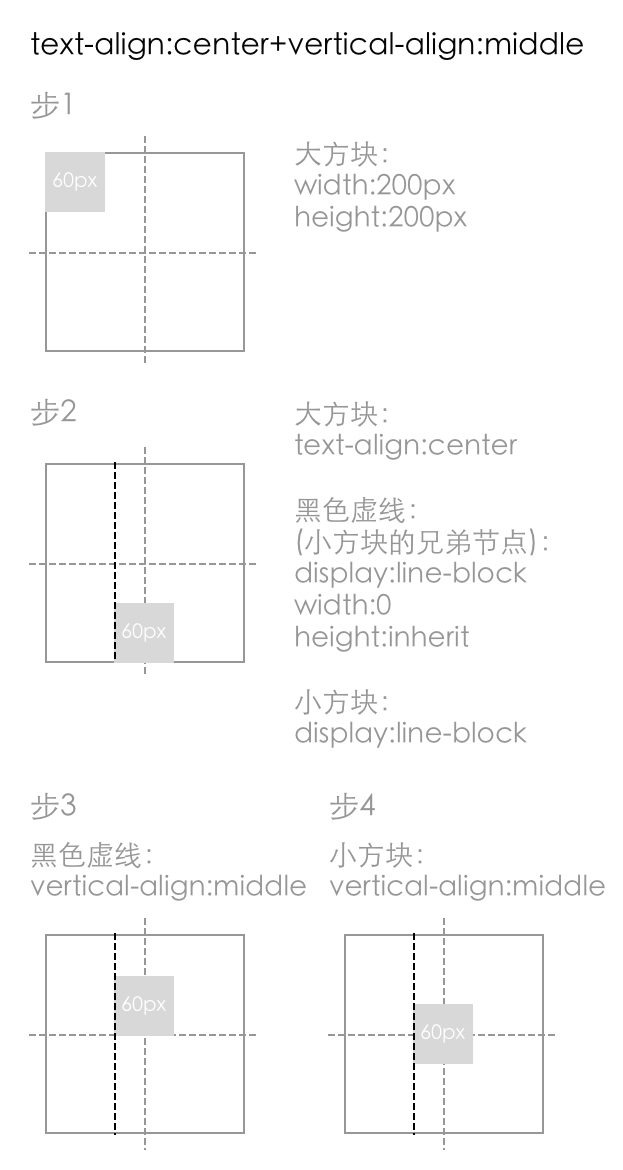
❖6.1 text-align:center + vertical-align:middle
css代码:
.wrap10{
	width: 100%;
	height: 400px;
	text-align:center;
	font-size: 0;
	background-color: #ccc;
}
.placeholder10, .ele10{
	vertical-align: middle;
	display: inline-block;
}
.placeholder10{
	overflow: hidden;
	width: 0;
	min-height: inherit;
	height: inherit;
}
.ele10{
	width: 100px;
	height: 100px;
	background-color: #333;
}
div代码:
<div class="wrap10">
  	<div class='placeholder10'><!--占位元素,用来作为居中元素的参照物--></div>
	<div class="ele10"></div>
</div>
图解:
例子截图:
解析:
行级元素会收到text-align和vertical-align的影响,这里首先是用text-center让inline-block水平居中,然后给一个vertical-align:middle,但是仅仅给vertical-align:middle是不够的,因为此时它还没有vertical-align对齐的参照物,所以就给了一个占位的inline-block,它的高度是100%。
这个方法对于居中元素不需要定款高,而且元素根据vertical-align值的不同不仅仅可以实现居中,还可以讲其放在上面下面等,缺点是父元素需要定高。
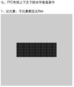
7 FFC布局上下文下的水平垂直居中
7.1 父元素、子元素都定义flex
css代码:
.wrap13{
	display: flex;
	align-items: center;
	justify-content: center;
	width: 400px;
	height: 400px;
	background-color: #ccc;
}
.ele13{
	background-color: #333;
}
div代码:
<div class="wrap13">
	<div class="ele13">
		居中居中居中居中居中居中居中<br>
	    居中居中居中居中居中居中居中<br>
	    居中居中居中居中居中居中居中<br>
	    居中居中居中居中居中居中居中<br>
	    居中居中居中居中居中居中居中
	</div>
</div>
图解:
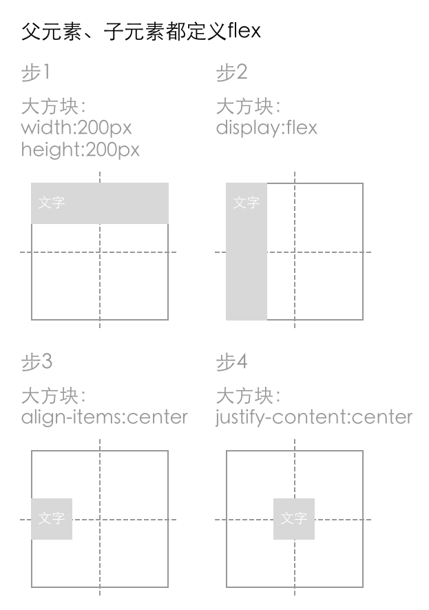
例子截图:
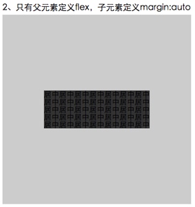
❖7.2 只有父元素定义flex,子元素定义margin:auto
css代码:
.wrap14{
	display: flex;
	width: 400px;
	height: 400px;
	background-color: #ccc;
}
.ele14{
	margin: auto;
	background-color: #333;
}
div代码:
<div class="wrap14">
	<div class="ele14">
		居中居中居中居中居中居中居中<br>
	    居中居中居中居中居中居中居中<br>
	    居中居中居中居中居中居中居中<br>
	    居中居中居中居中居中居中居中<br>
	    居中居中居中居中居中居中居中
	</div>
</div>
图解:
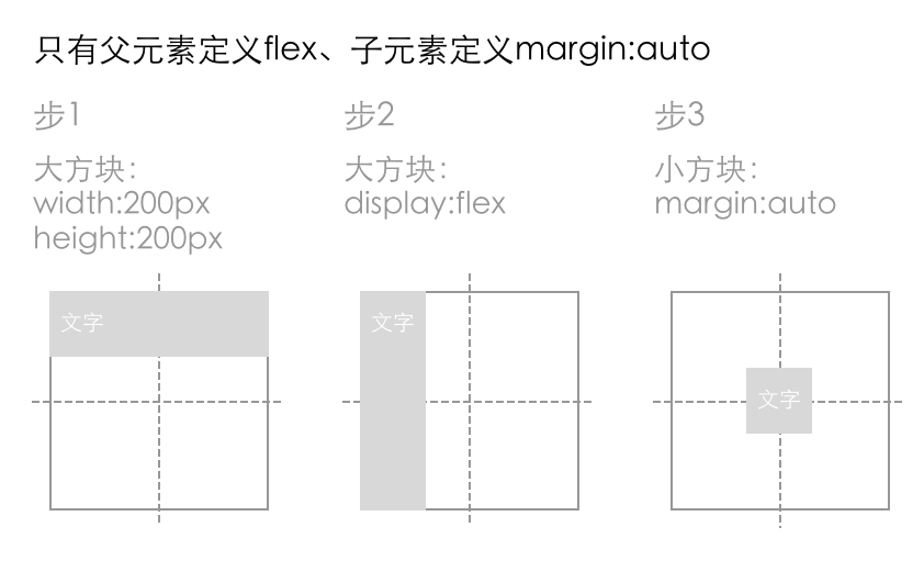
例子截图:
总结:
margin:auto在这里垂直方向也生效了。
Flexbox是个很强大的布局模块,也就三个属性就搞定居中了,而且不论父容器还是居中元素都可以不定宽高。
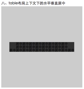
8 table布局上下文的水平垂直居中
css代码:
.wrap15{
	display: table;
	width: 400px;
	height: 400px;
	background-color: #ccc;
}
.ele15{
	text-align: center;
	vertical-align: middle;
	display: table-cell;
}
.ele15-inner{
	display: inline-block;
	background-color: #333;
}
div代码:
<div class="wrap15">
	<div class="ele15">
		<div class="ele15-inner">
			居中居中居中居中居中居中居中居中<br>
			居中居中居中居中居中居中居中居中<br>居中居中居中居中居中居中居中居中居中居中
		</div>
	</div>
</div>
图解:
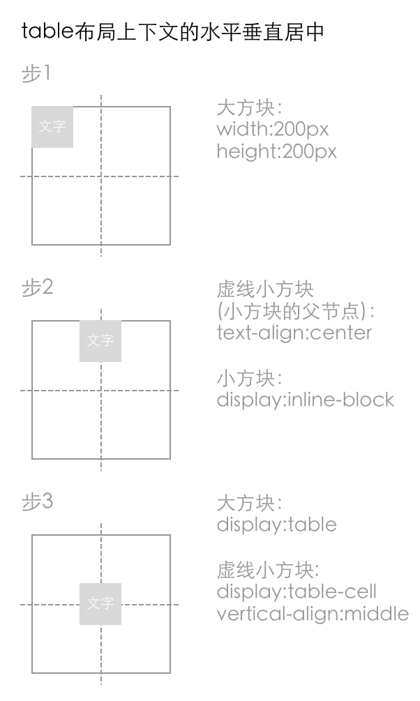
例子截图:
解析:
原理就是把div模拟成表格(换成真正的表格标签也是可以的),然后给那几个属性就成了。